


When you are designing a website, it is very important that your content should be readable and also looks good on all screen sizes.
In this article, we are going to learn about media queries in CSS, How you can make a responsive design that supports all screen sizes.
What is responsive design?
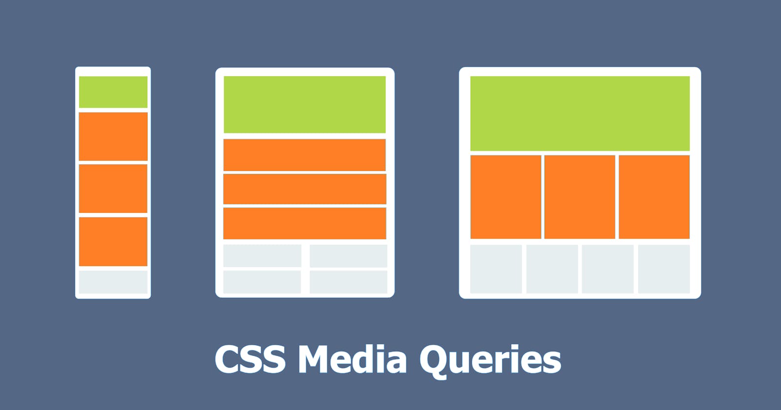
Responsive design is a technique for ensuring that your content looks good on all screen sizes. Everything on your website – layout, fonts, images – automatically adjusts to your device. In today's world, we need to consider devices like desktops, laptops, tablets, mobile phones, etc, and make sure that the website works on all platforms properly. So in order to make the website fully responsive media queries are used.
So What is a Media Query?
Media queries are used in CSS to apply different styles based on browser properties such as width, height, and screen resolution.
Syntax For Media query
@media media-type (media-feature){
/*Styles go here*/
}
Let's talk about what this syntax actually means.
The @ media is a type of CSS At-rule. These rules determine how CSS is displayed based on certain conditions. A media type refers to a device's media category. Various media types include all, print, screen, and screen.
all - This works for all the devices
print - This works for devices where the media is in the print preview mode
screen - This works for devices with screens
speech - This works for devices like screen readers where the content is being read out to the user
But in most cases, the syntax which is written below is used instead of the syntax which was mentioned earlier.
@media (media-feature){
  /*Styles go here*/
}
Media features refer to browser properties such as viewport height and width, orientation, and aspect ratio, and many more. Media feature expressions are tested for existence or value and are completely optional. Each media feature expression must be enclosed in parentheses.
As we talk more about media queries I will be explaining them by giving some examples.
Logical Operators
You can create complex media queries using the logical operators not, and, only, or. You can also combine multiple media queries into a single rule by separating them with commas.
and: Used to combine multiple media features into one media query. And it is also used to connect media types and media features.
not: This operator converts true queries to false queries and false queries to true queries.
, (comma): This operator separates multiple media features with commas and applies the style inside the braces if any of the conditions are true.
Examples
Let's consider some scenarios and use media queries.
Scenario 1:
I want to change the background color of the body to orange and the font size of the element to 30px if the device width is 600 pixels or less.
Solution:
In CSS, I will add (max-width: 600px) to my media query. This tells the computer to target devices with a screen width of 600px or less and inside the media query, I will target the body element and change its background color to orange and font size to 30px.
@media (max-width: 600px) {
  body {
    background-color: orange;
    font-size:30px;
  }
}
Example
Scenario 2:
I want to change the background color of the body to orange and the font size of the element to 30px if the device width is between 600 and 768 pixels.
Solution:
In the CSS with the help of and operator , I will add (min-width: 600px) and (max-width: 768px) to my media query. This tells the computer to target devices with a screen between the width of 600px and 768px and inside the media query, I will target the body element and change its background color to orange and font size to 30px.
@media (min-width: 600px) and (max-width: 768px) {
  body {
   background-color: orange;
    font-size:30px;
  }
}
Example
Here you will see that the background color is changed to orange and the font size is changed to 30px when the width of the screen is between 600px and 768px.
Breakpoints for different devices
These are the list of common Breakpoints used.
320px — 480px: Mobile devices
481px — 768px: iPads, Tablets
769px — 1024px: Small screens, laptops
1025px — 1200px: Desktops, large screens
1201px and more — Extra large screens, TV
Conclusion
In the end, I would like to say it is very important to target all screen sizes, and media query lets you do it and style those elements accordingly.
I hope you found this article helpful, if you want to dive deeper then you can refer to this link.