

In today's article, we are going to talk about CSS Flexbox which helps us to create basic as well as advanced website layouts in a responsive way.
What Is Flexbox?
A Flexbox is nothing but a layout that arranges all the elements in the container in one direction with different sets of properties that allows us to design the layout as per our needs without using float and position properties.
Flexbox makes it easy to resize and rearrange flexible containers and their elements in one dimension.
It is a one-directional model, that is it only allows the arrangement of the elements in the container in one direction, either column-wise or row-wise.
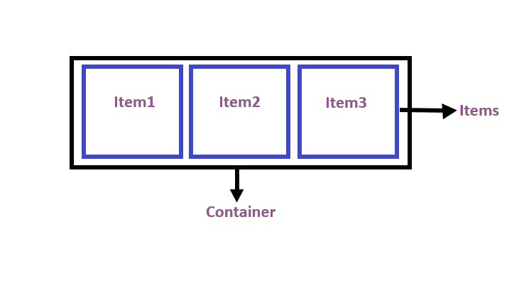
Flex Container
A flex container is an element that has the property of display: flex or display:inline-flex which are applied to its child elements.
Flex items
Flex items are nothing but the direct children of the flex container
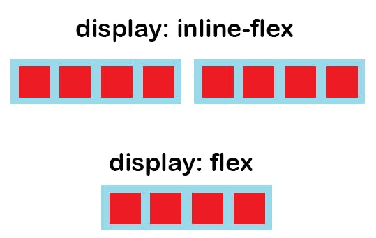
Display:flex vs Display:inline-flex?
The display property set as the flex will make the container block-level model.
The display property set as the inline-flex will make the container inline-level model.
The image below will give you a good idea about flex and inline-flex values.
Before going further let us understand what is the main axis and what is cross axis because the working of the flexbox depends on this axis.
Main axis and Cross axis
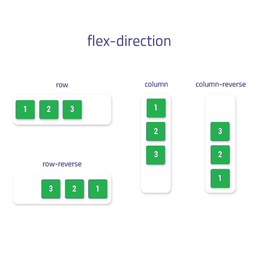
The main axis depends on the flex-direction property which is either top to bottom if the property is set to column, bottom to top if the property is set to column-reverse, or left to right if the property is set to row, right to left if the property is set row-reverse.
The cross-axis is perpendicular to the main axis, so if the flex-direction is set to row or row-reverse, the cross-axis runs along the columns, and if the flex-direction is set to column or column-reverse, the cross-axis runs along the row.
To use flexbox there are many properties that are applied to the container in order to design the layout as per our needs.
Here is the list of properties that are applied to the container:
flex-direction
flex-wrap
flex-flow
justify-content
align-items
align-content
Flex Direction
It tells the browsers in which direction the child elements in a container should be arranged either row-wise or column-wise. By default, the flex-direction property works row-wise.
flex-direction:row - The items in the container will be displayed row-wise.
flex-direction:column - The items in the container will be displayed column-wise.
flex-direction:row-reverse - The items in the container will be displayed row-wise but from the reverse side.
flex-direction:column-reverse - The items in the container will be displayed column-wise but from the reverse side.
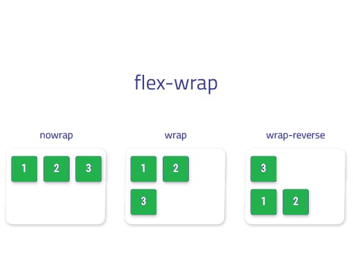
Flex-Wrap
The flex-wrap property specifies whether the browser should wrap overflowed flex elements to multiple lines.
The flex-wrap property can accept the following values:
- wrap - This will move all the overflow items from the container to the next line.
selector{
 display: flex;
  flex-wrap: wrap;
}
- nowrap - In this case, all the items in the container will be placed on a single line. This is the default value for the flex-wrap property.
selector{
 display: flex;
  flex-wrap: nowrap;
}
- wrap-reverse - This will also move all the overflow items from the container to the next line but in reverse order.
selector{
 display: flex;
  flex-wrap: wrap-reverse;
}
Flex-flow
The flex-flow is a shorthand property for flex-direction and flex-wrap which helps to reduce the line of code.
so instead of writing
.container{
  display: flex;
  flex-direction: column;
  flex-wrap: wrap;
}
We can write
.container {
  display: flex;
  flex-flow: column wrap;
}
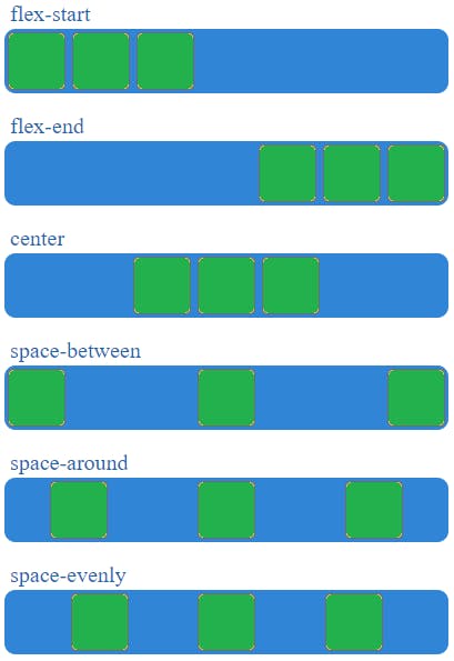
Justify-content
The justify-content property specifies how the browser aligns the flexible container's elements along the flexbox main axis.
The justify-content property can accept the following values:
- flex-start - This will make items in the container appear from the main-start edge of the container with respect to the main axis.
selector{
    display: flex;
    justify-content: flex-start;
}
- center - this will align a flexible container's items to the center of the flexbox's main axis
selector{
    display: flex;
    justify-content:center;
}
- flex-end - This will make items in the container appear from the main-end side of the container with respect to the main axis
selector{
    display: flex;
    justify-content: flex-end;
}
- space-between - This will align the first item of the container at the main-start side and align the last item at the main-end side of the container and it will give even space to the remaining items between the first and last item.
selector{
   display: flex;
    justify-content: space-between;
}
- space-around - This will add equal space to each side of the flex containers item, but the space before the first item and after the last item will be half the width of the space that is between each pair of elements
selector{
    display: flex;
    justify-content: space-around;
}
- space-evenly - This will add even space to all the items in the flex container.
selector{
    display: flex;
    justify-content: space-evenly;
}
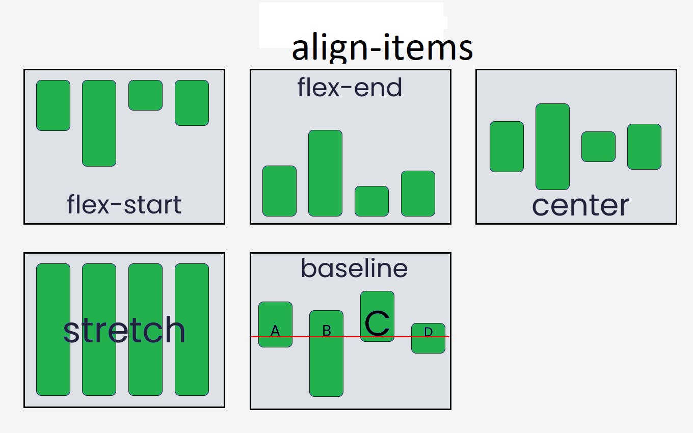
Align-items
The align-items property specifies how the browser should align the flex container's items along the flexbox's cross-axis.
The align-items property can accept the following values:
- stretch - The stretch is the default value for align-items. Stretches a flexible container's items to fill the cross-axis of the flexbox.
selector{
  display: flex;
  align-items: stretch;
}
- flex-start - The flex-start value aligns the flexible container's items with the cross-start edge of the flexbox's cross-axis.
selector{
  display: flex;
  align-items: flex-start;
}
- center - The center value aligns the flexible container's elements to the center of the flexbox's cross-axis.
selector{
  display: flex;
  align-items: center;
}
- flex-end - The flex-end value aligns the flexible container's items with the cross-end edge of the flexbox's cross-axis.
selector{
  display: flex;
  align-items: flex-end;
}
- baseline- The baseline value aligns the flexible container's elements with the cross-axis baseline of the flexbox.
selector{
  display: flex;
  align-items: baseline;
}
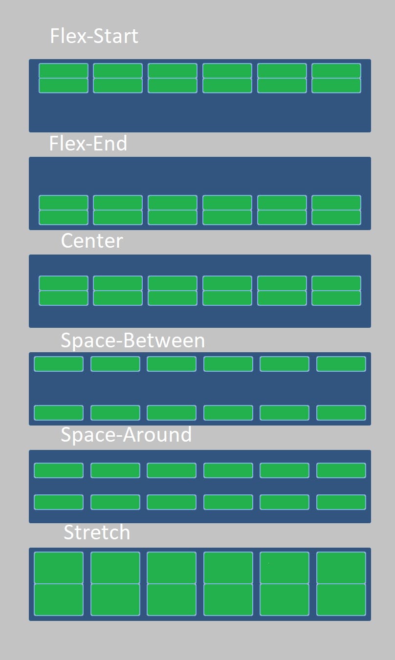
Align-content
The align-content property specifies how the browser aligns the flexible container's elements along the flexbox cross-axis.
The align-content property can accept the following values:
- stretch - This value stretches the flexible container's lines to fill the flexbox's cross-axis.
selector{
  display: flex;
  align-content: stretch;
}
- flex-start - The flex-start value aligns a flexible container's lines with the cross-start edge of the flexbox's cross-axis.
selector{
  display: flex;
  align-content: flex-start;
}
- center - The center value aligns a flexible container's lines to the center of the flexbox's cross-axis.
selector{
  display: flex;
  align-content: center;
}
- flex-end - The flex-end value aligns a flexible container's lines with the cross-end edge of the flexbox's cross-axis.
selector{
  display: flex;
  align-content: flex-end;
}
- space-between - This will align the first line of the container at the main-start side and align the last line at the main-end side of the container and it will give even space to the remaining lines between the first and last line
selector{
  display: flex;
  align-content: space-between;
}
- space-around - The space-around value assigns equal spacing to each side of a flexible container's lines.
selector{
  display: flex;
  align-content: space-around;
}
- space-evenly - This will add even space to both ends of the container and between its lines
selector{
  display: flex;
  align-content: space-evenly;
}
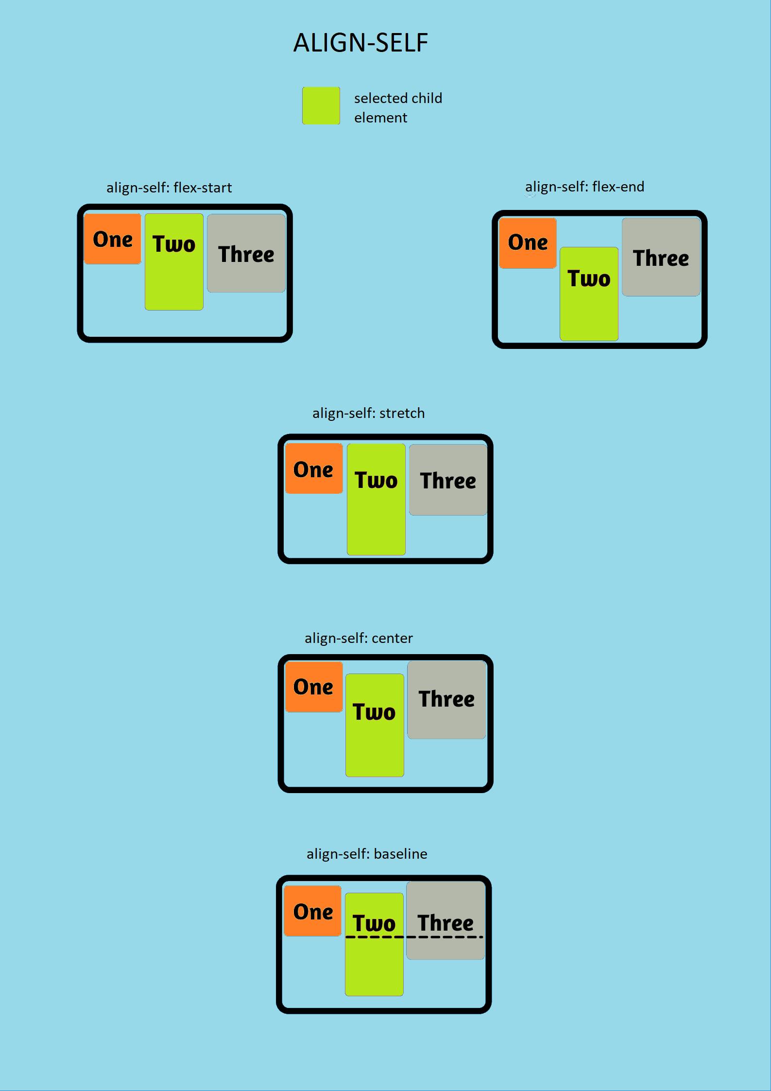
Align-self
To align individual elements vertically, use the align-self property. Applies to flex items, not flex containers. It makes sense to override the alignment specified for the flex container using the align-items property.
The align-self property can accept the following values:
- stretch - The stretch value stretches the selected flexible items to fill the flexbox's cross-axis.
.flex-item {
  align-self: stretch;
}
- flex-start - The flex-start value aligns the selected flexible items with the cross-start edge of the flexbox's cross-axis.
.flex-item {
  align-self: flex-start;
}
- flex-end - The flex-end value aligns the selected flexible items with the cross-end edge of the flexbox's cross-axis.
.flex-item {
  align-self: flex-end;
}
- center - The center value aligns the selected flexible items to the center of the flexbox's cross-axis
.flex-item {
  align-self: center;
}
- baseline - The baseline value aligns the selected flexible items with the baseline of the flexbox's cross-axis.
.flex-item {
  align-self: baseline;
}
Order
It allows you to reposition flexbox items without changing the HTML structure or layout. By default, the order of the items is set to 0 value. If the value of the order is -1 then the item will move to the start of the line and if the value of the order is 1 then it will move to the end . If more than one item has the same order values then it will be displayed as per the original layout.
In the above example check the HTML structure and then check the output, you will see that it is not matching because with the help of the order property I have changed the position of item1 to 3 and item6 to 4.
Flex-grow
The flex-grow property tells the browser how much flexbox leftover space to add to the size of the selected flexible element. The default value of flex-grow is 0.
.flex-item {
  flex-grow: 0.5;
}
In the above example with the help of flex-grow property we made the browser take half of the parents leftover space to the item3's size.
Flex-shrink
The flex-shrink property tells the browser how much to shrink the given flexible element if the sum of all element sizes exceeds the flexbox size. If the size of the flexbox is insufficient for the items to fit in it then it will shrink the items so that the item can fit into the container. So the default, value for flex-shrink is 1. An item with flex-shrink value set to 0 won't be shrunk.
.flex-item {
  flex-shrink: 0;
}
%[codepen.io/shubham_06/pen/RwJyxzR]
So in the above example, we have blocked the shrinking of item 3 by setting the flex-shrink property value to 0.
Flex-basis
With the help of flex-basis we can set the initial length of the flexible item. By default the value that is set is auto. The flex-basis property has higher specificity than the width property, so if both properties are provided then the browser will consider the flex-basis property.
.flex-item {
  flex-shrink: 0;
}
%[codepen.io/shubham_06/pen/GRGdQZW]
In the above example, we have given the initial length of item 3 to 100px.
Flex
The flex is a shorthand property for flex-grow, flex-shrink and flex-basis which helps to reduce the line of code.
so instead of writing
.item{
  flex-grow: 0.5;
  flex-shrink: 0;
  flex-basis: 100px;
}
We can write
.item{
  flex: 0.5 0 100px;
}
Congratulations on making it here. I hope now you have a clear idea about how to use flexbox and its different properties.
I have a link to a game where you can easily learn and practice flexbox.